A rule of thumb is a principle with broad application that is not intended to be strictly accurate or reliable for every situation. It is an easily learned and easily applied procedure for approximately calculating or recalling some value, or for making some determination.
So when dealing with typography its about the type size also. The general rule of thumb is for line length to be no more than 2 alphabets long, or around 50-60 characters in length. Another way to figure line length is to multiply the point size by 2 (with the multiplied size measured in picas). These rules must be altered slightly when using a typeface with a larger x-height (lines can be longer or leaded more) or with a small x-height such as a delicate script (lines should be shorter). Of course, script or other fancy faces are not appropriate for big blocks of type.
In typograpghy, a column is one or more vertical blocks of content positioned on a page, separated by margins and/or rules. Columns are most commonly used to break up large bodies of text that cannot fit in a single block of text on a page. Additionally, columns are used to improve page composition and readability. Newspapers very frequently use complex multi-column layouts to break up different stories and longer bodies of texts within a story. Column can also more generally refer to the vertical delineations created by a typographic grid system which type and image may be positioned.
For best legibility, typographic manuals suggest that columns should contain roughly 60 characters per line. One formula suggests multiplying the point size of the font by 2 to reach how wide a column should be in picas — in effect a column width of 24ems. Following these guidelines usually results in multiple narrow columns being favored over a single wide column. Historically, books containing predominantly text generally have around 40 lines per column. However, this rule of thumb does not apply to more complex text that contain multiple images or illustrations, footnotes, running heads, folios, and captions.
Column contrast refers to the overall color or greyness established by the column, and can be adjusted in a number of ways. One way is to adjust the relationship between the width and height of the column. Another way is to make adjustments to the typeface, from choosing a specific font, to adjusting weight, style, size and leading. Column contrast can be used to establish hierarchy, to balance the page composition, and to visually activate areas of the page.

 Examples of font size
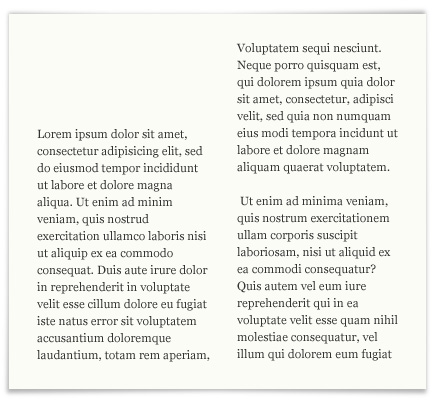 Example of columbs/blocks